With trains on the Southern Line at times being as unpredictable as the weather in Cape Town, we felt it would be great to take a look back at the months of June 2017 and 2018. By retrospecting, we can see what the effects were from the challenges of the rail system. Some of these challenges woud have been cable theft, faulty signals, manual authorizations or even planned upgrades. Just like the weather in Cape Town, on any given day you can either be affected by one of these or a combination of all of them.
To be able to properly assess the effects of these scenarios one would need a way to track data related to movements of the trains. Luckly the Wizzherd app empowers commuters to track the trains for their daily commute. The data that is generated by the app can then be analyzed. Through the analysis, we can then start asking interesting questions like, how late were the trains running during a certain period of time? What times of the day tended to have extended travel times? Lastly, which areas were the most common places for trains issues to occur. We hope that by looking into the data that we can unravel some answers to these questions.
By abstracting the data from one of our most active users, we can respect their privacy and learn from their commuter experiences. This enables us to study the data and assess the operational behavior of the trains on the Southern Line. *Note that this information might only present a portion of the combined train performance for the specifed time frame.
Below are a series of charts which consist of two periods of the day. These periods are broken up into morning “AM” train trips which are in the direction of Cape Town and evening “PM” trains were in the direction of Retreat.
Lower is better
Just a Dash of Delays
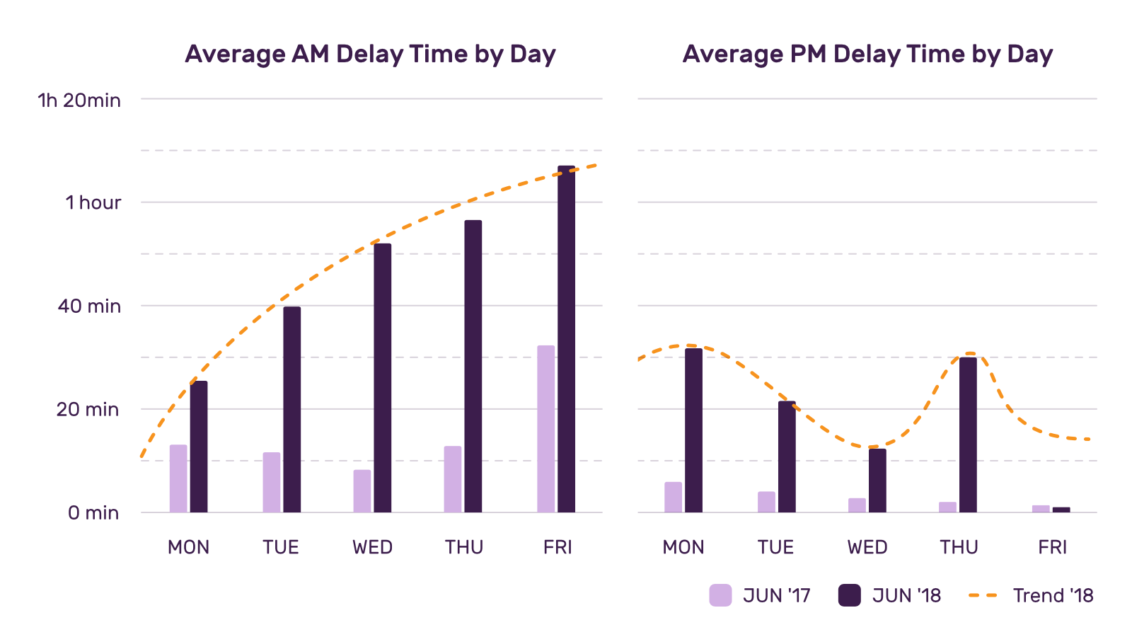
Let us start off by comparing the average amount of time which created delays from June 2017 to June 2018. A delay would be considered as the scheduled train departure time versus the actual departure time that has been recorded with the Wizzherd app. Based on the data, it is clear to see that there was definitely an increase in the duration of delays for 2018*. The durations of delays in the morning also seemed to be longer as the week drew closer to Friday.
According to the statistics in the Myline publications of 2018, only an average 15.98 % of AM trains and 22.52 % of PM trains arrived on time during this period**. The MyLine publication is a weekly newspaper which attempts to keep commuters informed about the operations and happenings of the public transport rail service. By referencing MyLine, it is clear to see how duration of delays from 26 minutes to just over an hour can affect the punctuality of trains. Unfortunately as a result of these kinds of delays, one of the effects of would be the overcrowding of trains and another would be the cancellation of the following scheduled train service, as seen in the post below.
#SouthernLineCT T0116 arrived at Cape Town 24mins late. T0127 the turn around of T0116 is cancelled due to its late arrival.
— Metrorail W/Cape (@CapeTownTrains) June 5, 2018
Lower is better
Continuous Cancellations
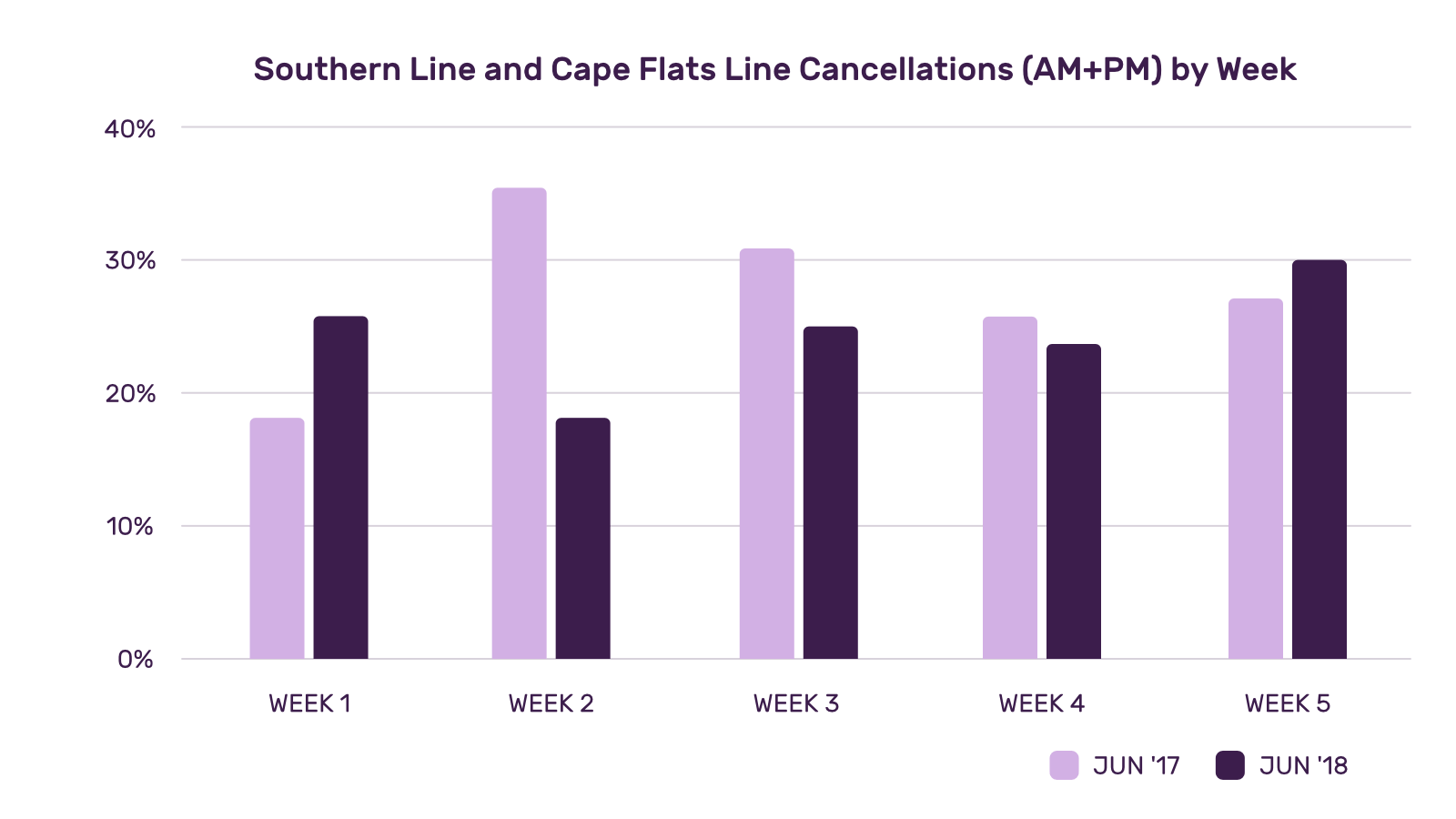
What can be seen here is a clear comparison of the amount of cancellations per week on the Southern Line and Cape Flats Line. What is fascinating is that there has been slightly less cancellations in June 2018 than compared to the previous year, by almost 3.3 %. When comparing the delay durations, we don’t see a 3.3 % improvement but rather a increase in the duration of train delays. Based on the commuter data, it shows that a 3.3 % improvement is cancellations is not directly proportional to improving the duration of delays.
One might conclude that by having 3.3 % more trains available created additional strain on the operations of the line and resulted in additional manual authorizations. Another might conclude this to be a result of a combination of faulty infrastructure like railway light signals, motor vehicle booms and passenger train sets which were not able operate effectively. These faults would then all contribute to unfavourable congestion on the line and manual authorizations.
Next let's look at the travel duration of the train trips. It is easy to assume that trains departing late can be remedied simply if they abided more strictly to the train timetable. In order for that to be possible then the trip durations would have to be consistent and not affected by faulty infrastructure. But enough assuming, lets see what the data has to say.
Lower is better
Effects of Extended Travel Times
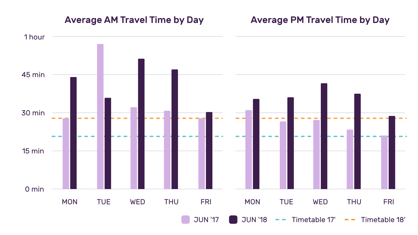
Based on the information collected we can see an increase in the average travel time. First thing to note is that the commuter also ended up travelling to Cape Town as opposed to Woodstock in 2017. According to the timetable it would take about 26 mins to reach Woodstock and an additional 3 mins to reach Cape Town, both are plotted with dashed lines on the graph. Based on the generated data, it shows that trains were taking longer than expected when compared to the timetable schedule and previous year's performance. At times there are also spikes in the data that affect the averages but they also serve as a indication of the unpredictable behaviour of the trains.
One of the common reasons for extended travel times during these two periods would be manual authorizations. Usually trains have a routine of only stopping at stations. Unfortunately due trains needing approval before entering sections of the line, they seemed to be stopping in inconvienent places between stations for lengthy periods of time.
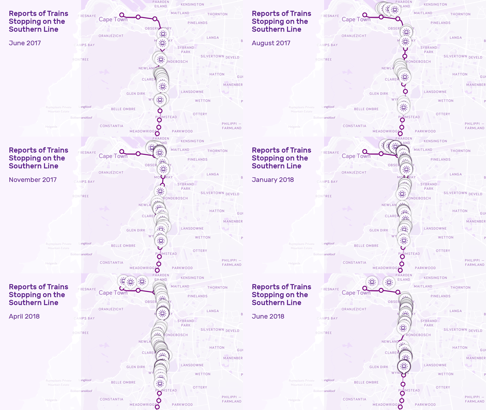
Visualization of commuter generated reports between June 2017 and June 2018
A Repertoire of Reports
Based on the reports collected between June 2017 and the end of June 2018, it is clear that was an increase in the amount of times the trains stopped. Reports from 2017 shows that trains were stopping more regularly between Claremont and Wynberg. In 2018, the same behaviours of 2017 are repeated but there was also an increase in reports of the train stopping around Rondebosch and Observatory. The only exception to the behavour displayed in these reports would be February 2018, as only one report was created by the commuter. If you would like to know more about the various reports created with Wizzherd then you can read the article here.
Looking Forward
It amazing to see how a combination of commuter trips recorded with the Wizzherd app can be visualized and analysed. This research shows a snapshot of the extent of how there was a decline in the delivery of service. The positive side of this is that now we have a benchmark to compare future trains trips. Thi will allow us to see if there has been any improvement. Also there are opportunites around areas where trains tend to stop. Perhaps these areas should be priotized for maintenance repairs to reduce delays and hopefully reduce cancellations too.
Greatest part of this process is that every tracked commute presented real-time information to other commuters using the Wizzherd app. If you would like to be apart of creating more reliable information the simply get the Wizzherd app on your Android phone. If you need help with getting started with Wizzherd then you can read the article here else you can also visit our Help section. We hope that you have found this article insightful and that you join us with starting the movement daily with your commute. Travel safely and we look forward to the next one.
Disclaimers:
* All data have been collected from a single commuter. Insights shown only serve as a portion of the information available. In most cases more than one trip was used to create the averages between morning peak and evening peak times.
** Statistics from MyLine publication are referenced from issues 239–243 which includes weeks from 31 May–3 July 2018.
